
Design Goes Retro: Lessons for Communicators

January 19, 2024
Ben Franklin – a design trendsetter in 2024?
I would argue, yes.
Amid the rapid advancement of technology and the apparent integration of AI into pretty much everything, there also exists a yearning for what’s real and human and authentic.
That authenticity can be conveyed in myriad ways, one of them being the fonts used for the written word.
This is where Mr. Franklin has renewed relevance.
In addition to being a founder of our nation and serial inventor, Ben was a printer. The story goes that he recommended printing the Declaration of Independence using a popular font (Caslon) at the time, both due to his having met William Caslon, and also so that King George would have absolutely no difficulty in reading the document.
What we are seeing in type trends today is a nod to fonts and styles of years past – less generic/slick/devoid of character -- more vintage and nostalgic – with brand history and relevance tied into their representation.
A few recent examples that we’ve spotted:
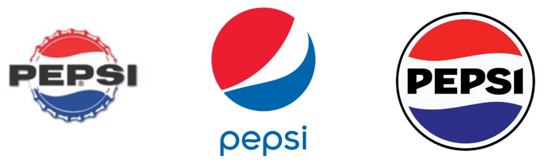
Pepsi’s recent rebranding at right captures a more nostalgic vibe (1960s logo to left).
Burberry also calls for an adapted version (right) of its 1901 mark (at left).

Baskin Robbins simplified and refreshed their mark (to right), using a heavier, more readable “31” retro style font (paying homage to its original 1947 “carnival” logo to left) and colors.

While the examples above demonstrate the transformation of the brand mark itself, this sets the stage for the natural brand extensions into every other communication vehicle the brand will embody – not only in design but in brand language and positioning.
This opens the door to weaving a sense of authenticity and humanity evolving from the brand origins in web design, social media, marketing and collateral, internal and external communication, and content strategy development.
This is all done with a twist of sorts – preserving the visual “roots” while also ensuring a relevant and modern feel.
Clearly this may not be the best approach for every rebrand project, but it is often worth considering Ben Franklin’s sage advice delivered way back in 1735: “Look before, or you’ll find yourself behind.”
Finding that just-right font that will resonate with your target audience can go a long way toward making an authentic human connection in a world in which they are fast becoming fewer and far between.